
Color accuracy represents one of the most critical aspects of professional printing, directly impacting brand consistency, visual appeal, and overall project success. The choice between Pantone spot colors and CMYK process printing significantly influences the final output, making it essential for designers, marketers, and business professionals to understand the fundamental differences between these two printing methodologies.
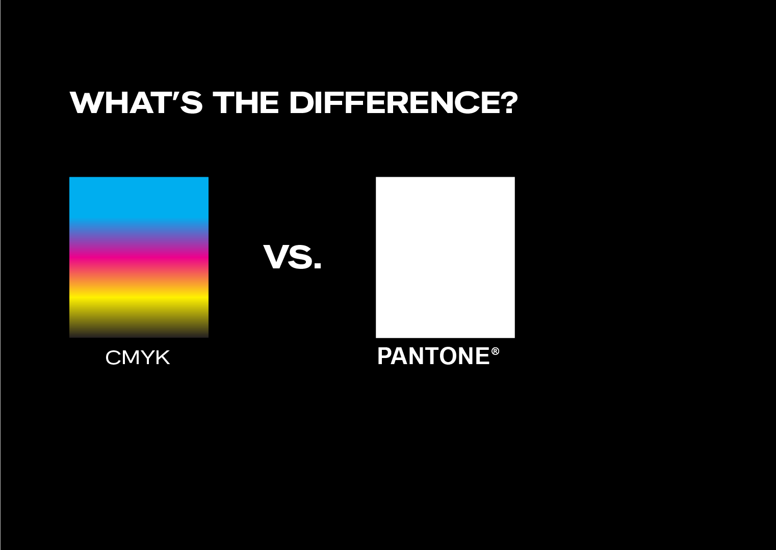
Understanding the Two Printing Methodologies
Pantone spot colors utilize pre-mixed ink formulations that are created according to standardized specifications established by Pantone Inc. Each color receives a unique identification number and follows precise mixing ratios to ensure uniformity across different printing facilities and equipment. This system provides a standardized color language that facilitates consistent communication between designers, clients, and print service providers.

CMYK process printing operates on a subtractive color model, combining four standard ink colors: Cyan, Magenta, Yellow, and Key (Black). Through halftone dot patterns and varying ink densities, this four-color process can reproduce a substantial portion of the visible color spectrum. The method relies on the optical blending of these primary colors to create the appearance of additional hues.
Advantages of Pantone Spot Color Printing
Superior Color Consistency
Pantone spot colors deliver exceptional consistency across multiple print runs, regardless of the printing facility, equipment, or timeline. This reliability stems from the standardized ink formulations that maintain identical color properties when properly mixed and applied. Major corporations leverage this consistency to protect brand integrity and ensure their visual identity remains uniform across all marketing materials and touchpoints.
The standardization proves particularly valuable for organizations with distributed printing needs, where materials may be produced at different locations or times while maintaining brand compliance.
Broader Spectrum Color Range
Pantone spot colors deliver intense, pure hues that exceed the color reproduction capabilities of standard CMYK printing. This wider spectrum encompasses luminous colors, metallic finishes, and richly saturated shades that remain unattainable through traditional four-color processes. Organizations demanding exact color precision or striking visual distinction frequently depend on spot color applications to meet their specifications.
Custom ink compositions, featuring metallic, pearlescent, and luminescent varieties, offer expanded design opportunities that strengthen visual impact and brand recognition.
Benefits of CMYK Process Printing
Comprehensive Color Reproduction
CMYK process printing demonstrates remarkable versatility in reproducing photographic content and complex color gradations. The four-color system can generate thousands of color variations through halftone screening techniques, making it particularly well-suited for publications, marketing materials, and any project requiring full-color imagery.
This approach excels in reproducing natural color relationships found in photography, artwork, and detailed illustrations where smooth color transitions and subtle tonal variations are essential.
Cost Efficiency and Production Speed
CMYK printing offers significant economic advantages for projects requiring multiple colors or complex imagery. Since all colors are produced using the same four ink stations, the cost remains consistent regardless of the number of colors appearing in the final design. This efficiency makes CMYK the preferred choice for high-volume publications, catalogs, and marketing materials containing diverse color palettes.
Production timelines also benefit from CMYK's streamlined setup requirements, as printers can process jobs more quickly without the need for multiple spot color preparations.
Limitations and Considerations
Pantone Spot Color Constraints
While spot colors excel in consistency and specialty applications, they present limitations for complex, multi-color designs. Each additional spot color increases production costs and setup time, making them less economical for projects requiring numerous color variations. Additionally, spot colors are not well-suited for reproducing photographic content or complex color gradations that require smooth transitions between multiple hues.
The cost factor becomes particularly significant when budgets are constrained or when printing volumes do not justify the additional expense of multiple ink setups.
CMYK Process Limitations
CMYK process printing cannot reproduce certain highly saturated colors, particularly bright oranges, electric greens, and vibrant purples that fall outside its color gamut. Metallic effects, fluorescent colors, and other specialty finishes are also beyond CMYK's capabilities, requiring spot color alternatives for these applications.
Color consistency may vary between print runs due to factors such as environmental conditions, paper characteristics, ink density variations, and equipment calibration. While modern printing technology has significantly improved consistency, CMYK still cannot match the absolute uniformity provided by standardized spot colors.
Strategic Selection Criteria
When to Choose Pantone Spot Colors:
- Brand consistency requirements are paramount
- Specialty colors beyond CMYK's spectrum are essential
- Simple designs with limited color palettes
- Premium projects where color accuracy justifies additional costs
- Corporate identity materials requiring standardization across multiple vendors
When to Choose CMYK Process Printing:
- Projects featuring full-color photography or complex imagery
- Designs incorporating numerous color variations
- Budget constraints necessitate cost-effective solutions
- Quick turnaround times are essential
- High-volume printing where setup costs become prohibitive for multiple spot colors
Hybrid Approach: Combining Both Methods
Professional printing projects often benefit from strategic combinations of both Pantone spot colors and CMYK process printing. This hybrid approach allows organizations to achieve optimal results by leveraging the strengths of each method where most appropriate.
Common applications include corporate publications where photographic content prints in CMYK while company logos utilize spot colors for precise brand compliance. This strategy provides cost-effective full-color reproduction while maintaining critical brand consistency elements.
Conclusion
Understanding the fundamental differences between Pantone spot colors and CMYK process printing enables informed decision-making that aligns with project objectives, budget parameters, and quality requirements. Each method serves distinct purposes within the professional printing landscape, and neither represents a universally superior solution.
Pantone spot colors excel when precision, consistency, and specialty effects are priorities, while CMYK process printing provides versatility and cost efficiency for complex, multi-color applications. Success lies in matching the printing method to the specific requirements of each project.
Collaboration with experienced printing professionals ensures optimal method selection and execution. Their expertise can guide technical specifications, identify potential challenges, and recommend solutions that achieve desired outcomes within established constraints.
The evolution of printing technology continues to enhance both methodologies, expanding capabilities while maintaining their distinct advantages for different applications in professional communication and marketing.