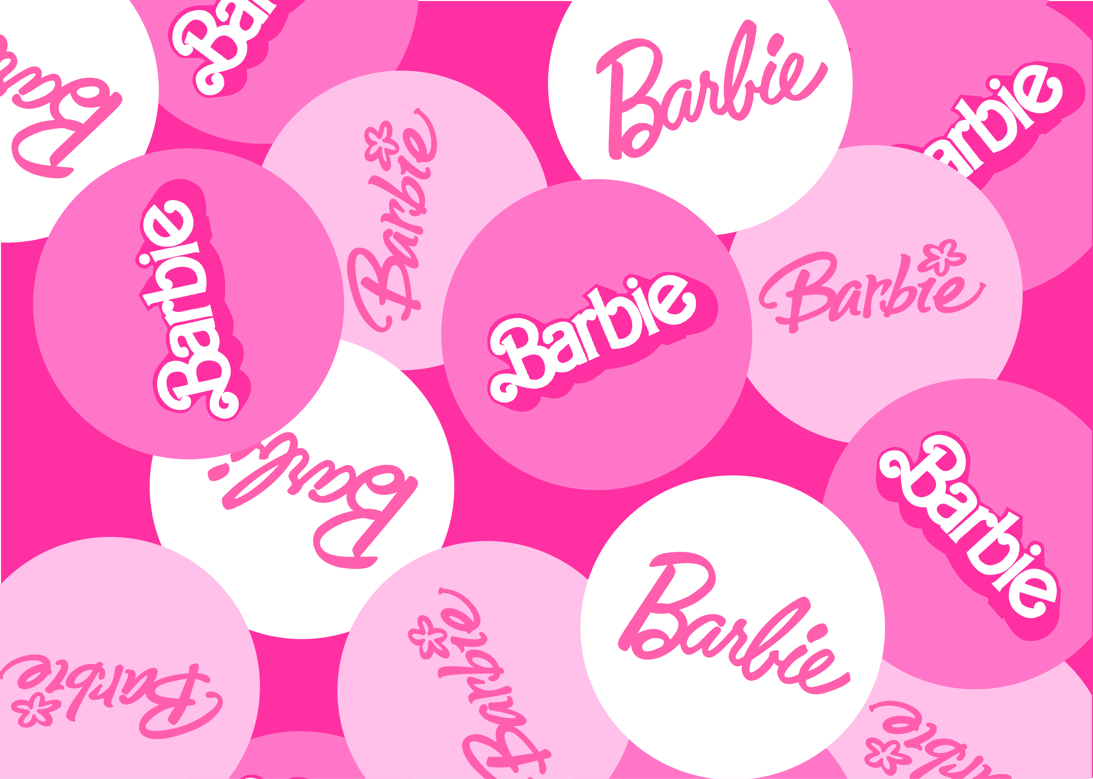
Barbie is one of the most iconic brands in the world, and its logo is just as recognizable. But did you know that the Barbie logo has evolved over time? Let's have a deep dive together into the stories each of the Barbie logo while exploring both the emotions and experiences.

The first Barbie logo was introduced in 1959, it was when Barbie made her first appearance. Barbie was not just a doll but it was an icon for younger girls. The original logo was a simple, delicate handwritten font in a soft pink color.
Fast forward to the mid 1970s, the feminist movement was flourishing. The logo was updated in 1975 to a more modern, 3D font. The 3D style reflected the brand's efforts to cope with the changes while still maintaining their identity.
By the 1990s, Barbie is now an icon, admired by children around the world. With the technology revolution and advancement, Barbie still maintained it's strong stance. The 1991 logo was a departure from the previous two, with a bolder font and a brighter pink color. Then the 1999 logo represented a nostalgic nod to Barbie's roots, with a return to the original handwritten font, albeit with a slight tilt.

After entering the 2000s, the Barbie brand remained strong however it needed to adapt to the changing cultural notions. So in 2004 the additional of the flower on top of the logo symbolized growth and renewal. However, this change did not last long. In 2005 the logo reverted back to its original look to ensure timeless appeal and relevance to the then current technology evolution. It was like Barbie was saying "I'll stay true to myself, while embracing the future".
Finally in 2009, it was the era of minimalism and modernity. It is considered the most simple version of the logo with a modern twist in a light pink color.
The evolution of the Barbie logo reflects design and marketing shifts. The first logo was simple and elegant, embodying the playful essence of Barbie. In 1975, the logo became contemporary to match changing preferences. By 1991, it became bolder with confidence, mirroring Barbie's popularity. In 1999, the logo returned to a classic design. In 2004, a whimsical touch was added with a flower, which was removed in 2005. The most recent logo, from 2009, is simple and modern, aligning with the brand's positioning.
The Barbie logo is more than just a way to identify the brand. It is a symbol of the Barbie brand's values and ideals. It is a reminder of the brand's commitment to empowering girls and inspiring them to reach their full potential.
The Barbie logo has evolved over time, but it has always retained its core meaning. It is a symbol of the Barbie brand's commitment to making the world a better place for girls.

